The Brand Book
I divised Maads’ brand guidelines to reflect the companies vision & ensure consistency and efficiency in every project.
̌

Maads is a hospitality management company with over 16 incredible properties and projects across Cambodia. Divided into six chapters over 100 pages, the Maads Brand Book was developed for properties, Maads HQ team and current and potential investors.
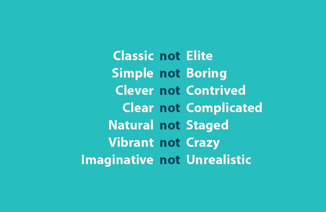
With bold yet extremely simple layouts, I used clever copy writing to ensure the message is clear.

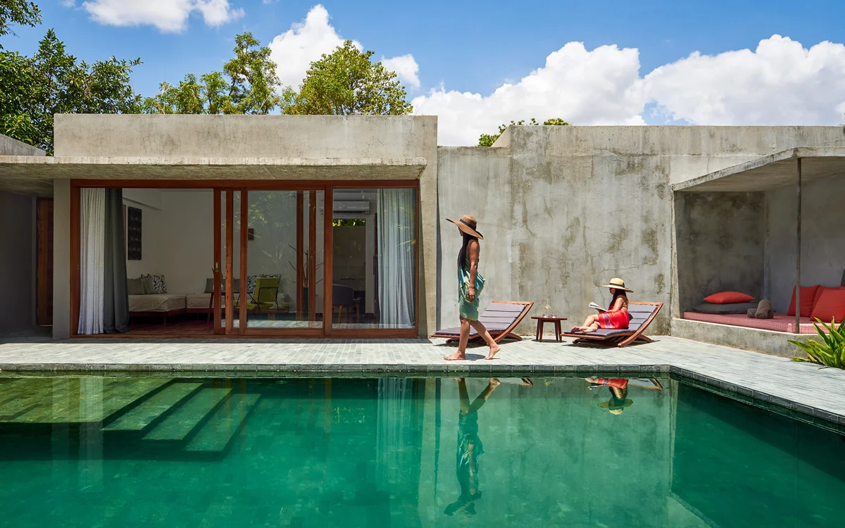
Photography is an essential part of reflecting Maads spirit and sense of place. Images are integral to distinguish the Maads brands, tell their stories and draw further interest. Image credit: Bruce DV

Maads has established authentic, ownable brands and experiences, each with their own personality and style, but sharing Maads’ defining core elements of nature, humanity, simplicity and creativity.

Contains strict guidelines on using the Maads Logo.

Explanation of the alternative versions of the Maads logo, when and how each should be used.

Maads typography provides clarity and legibility. The typefaces selected to reflect the distinctive tones and emotions associated with the Maads brand.

Colour is integral to Maads’ visual identity, consistency is the key to success. The primary colour palette consists of Dark Aqua Blue and lots of white space, ensuring clean, simple and elegant artworks.

Not only a brand guide to Maads as a whole, the book contains essential information about each Maads property, 16 in total around Cambodia.

A strict formula for creating a Maads property logo, ensuring consistency across the brand, along with efficiency within the design team.

Above all clarity and simplicity are the priorities of Maads’ communication style.